I have learned :
- that I don't like to use acetate. At all. No matter how pretty.
- the $2 a sheet specialty papers are not my thing and I really struggle to use them:(
- brads should never, ever again be purchased in 10 pound bags...
- there is such a thing as too much washi tape, mist & sprays.
- I don't do enough mixed media to justify the hundreds of gelatos, gessos, markers and stencils that I own.
- embossing folders and dies are not my thing and only get used when I force myself to.
Surprisingly, my style is much more simple than my shopping led me to believe:) It has been an eye opening struggle to work through my stash but the experience has led me to better habits. The last few things that I purchased got used up and not added to my stash. The papers and things that I let go of were forgotten as soon as they were boxed up and I don't feel any regrets. There have been zero "perfect page for that thing I gave away" moments!
In fact, I'm creating more and enjoying the process a lot more.
This page was inspired by this sketch.....
My sister posted a handful of photos of the kids before they went trick or treating and of her over the top Halloween neighborhood. Such a cute ninja turtle. Looking back, I wish that I had added some of the dangly bits that the sketch showed....
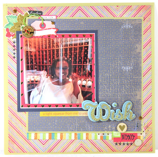
This page was inspired by this page on my pinterest boards (Lisa Dickinson. Love her work!) I DON'T do feathers. Ever. I was more interested in how she had her page laid out than I was what she used. My sister is trying to get us to move home so when I was there for the summer, she scheduled some houses for us to look at. I LOVED the Wine room in this house! Yeah, I was a little over excited...
Our entire wedding party. I love how simple the page is and the choice to change the photo to black and white....
Laura Vegas is a long time favorite designer of mine and this page was my inspiration. My page is not as clean and simple as hers but I still love it. My sisters neighbors went all the way out in decorating their house for Halloween didn't they?
Thanks for stopping by and hope you had a great weekend!


No comments :
Post a Comment