I mean pink?! What was going on in my head to think that the color scheme was a good one lol. Sometimes you just have to let go of an idea or concept that starts off as a brilliant aha moment in your head but ends up as a pink fishing layout in reality:). Honestly I have no problems tossing a page, photo or started project that isn't working for me. But before I let it go I do everything I can to make sure that it can't be transformed into something that will end up working.
This page was not awful enough for me to just chuck but I also knew that I would never be happy with it in my albums.
What was ok -
- the photos
- the story
- the basic arrangement
What was not ok -
- everything else!
Here is the made over page.....
I immediately got rid of the worst color scheme in the history of scrapbooking! Seriously bad! Then the themey embellishments (though really pretty) were ditched and I came up with a better title. Since it was a page about my husbands love of fishing, I added masculine touches like wood dots, cork, inked edges, metal and black splatters. The original journalling was typed on vellum and will be stapled to the page later on (I'm lazy that way lol).
I'm so much happier with the made over page and I think I will love it for years to come. If I could give any advice on the subject of making over projects, it would be that it's just paper! If a layout that you made is not making you happy get rid of it!! You can always start over!
Making over is something that I won't be doing with these next few pages because they make me happy and I think that they will make my family happy too when they see them.
Nowadays my family sees my pages here on my blog or on pinterest well before they see them in any album. Hi guys, I hope you love your pages:) Here they are.....
This page about my guys at my oldest sons USAF grad has my heart. Aaannndddd I just love how fun it is.....
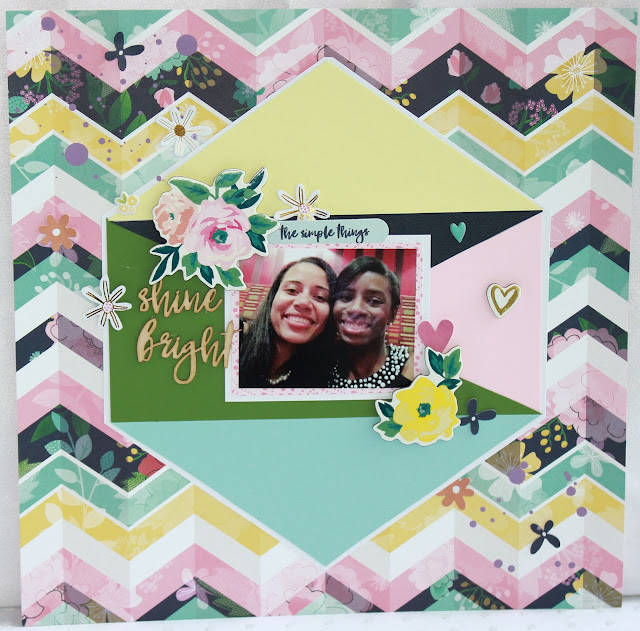
This is from my MAY Hip Kit. MAY! But this photo of my 2 baby sisters is one of my favorite ever and it was perfect for this page. The inspiration for the design came from a piece of art I pinned on pinterest ....
And my final page features another of the 300+ photos that my husband took at Q's senior photo shoot. I'm also doing a few more pages this week from that shoot. What can I say, the photo's turned out amazing! The products are from my May Hip Kit. Share Slacker here tee hee:).....
Thanks for stopping by:) Have a fantastic evening!!


No comments :
Post a Comment