I can confidently say that I do both. I am getting better about using the products that I buy and buying mostly the products that I will use. By making stash kits I have really been able to get to know my habits and am more aware of which products will actually make the page and which ones won't. Certain types of stickers and die-cuts are really pretty but I won't ever use them because they are not my style. The pages that I share today kinda reinforce that I don't need to force products onto the pages. That I really don't put things onto my pages just to "use them up". Every thing that I use has a purpose and a place on my pages and if I "use it up", that is a bonus:).
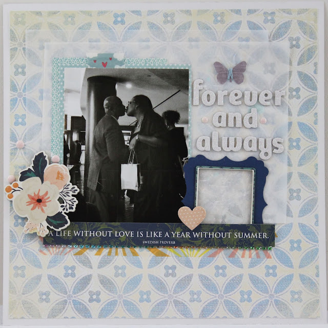
Frames. I really love frames and own 2 tons of them but they are a struggle for me to use! I'm almost done with N Damiano's class at SB.com and she used frames so well on her page. I didn't use them exactly as she had but I used them and that is what taking classes is all about for me. Using techniques, products and papers that I normally wouldn't. This page was completed pretty close to her design. I didn't have the chipboard set or paper. The paint technique that she did was so. much. fun.... It will be repeated again and again.... Just noticed that my letters are falling off:( UGHHH....
This is the page that I created using her design as inspiration. And that photo of me and the hubs again. This time in black & white. Heart it so much!!!
Wow, again with the old sketch. This photo of my daughter also has my heart and I based the page on a Basic Grey sketch from 2012. Love it all. The papers especially...
The next 2 layouts are also based on sketches. One from Studio Calico 2013 and the other I don't even know. I looked for them on pinterest but couldn't find either one.
It took a lot of time to make this page because I used a needle and pretty thread to stitch a box around each of the words. The subtle interest it adds was worth it...
This one was fun to make too. I used mostly white and gray cardstock to create the page. I had been holding on to those K&Co travel stickers since around 2008 so it was time to get them on a page. Surprisingly, the adhesive was still very sticky on the backs of them all. The title is my favorite part of this page....
As always, thanks for stopping by and having a look around!


No comments :
Post a Comment